eMaker Summer Release | Predictive Response
eMaker Summer Release
Welcome to the new and improved eMaker user interface!
What’s New?
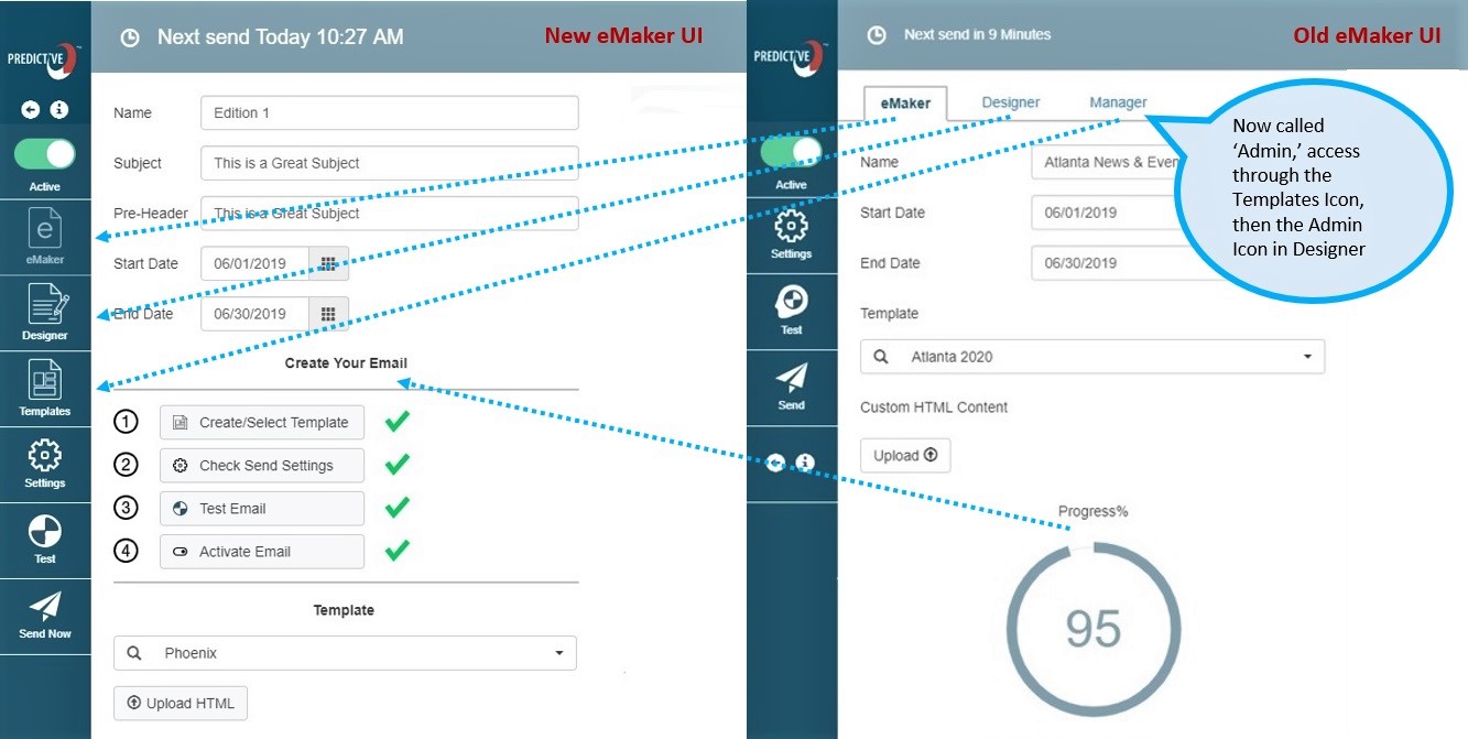
- eMaker, Designer and Manager tabs have moved to navigational icons on the left rail.
- Create your email in 4 easy steps by clicking through the ‘Create Your Email’ Steps. More info below.
- New ‘Templates’ icon takes you to your templates library with one click.
- Larger font on top message is clearer and easier to read.
- Back and information icons have been moved to the top of the left rail for easier access.
- Subject and pre-header fields have been moved to the left of the page for a larger email preview pane.
Now you can create your email in four easy steps!
Watch this video or see instructions below.
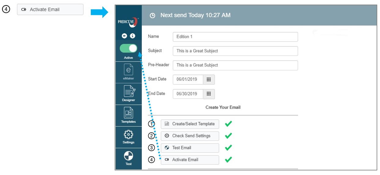
As you complete each step, you will see a green check mark so you can keep track of your progress.

-
- Create/Select Template
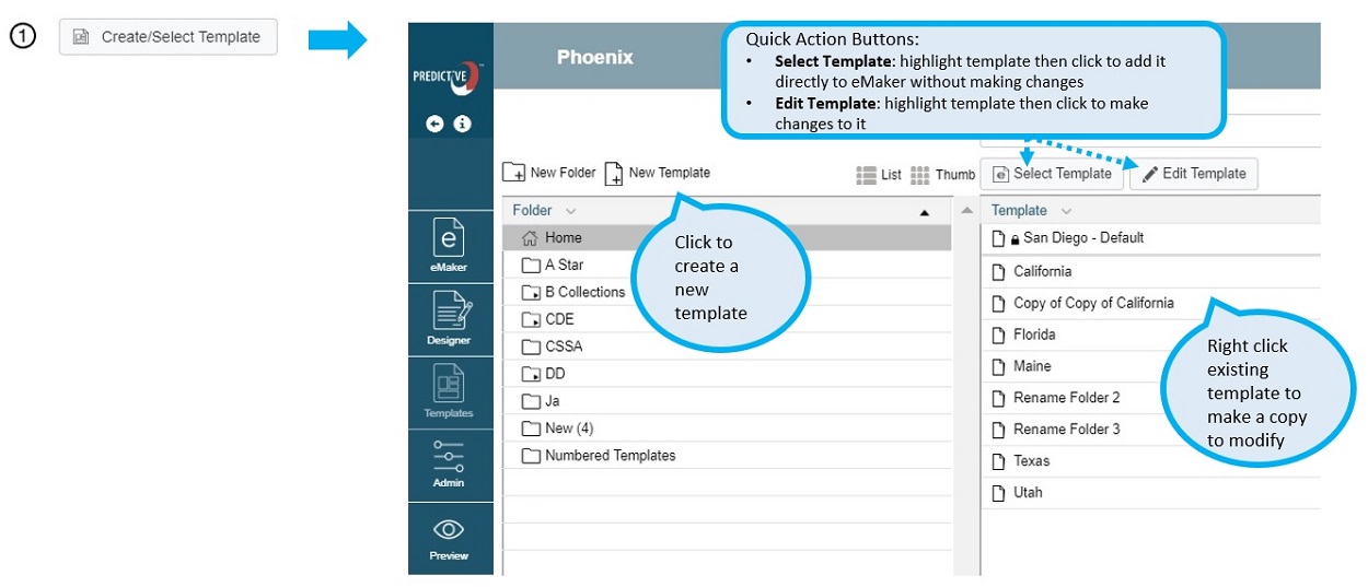
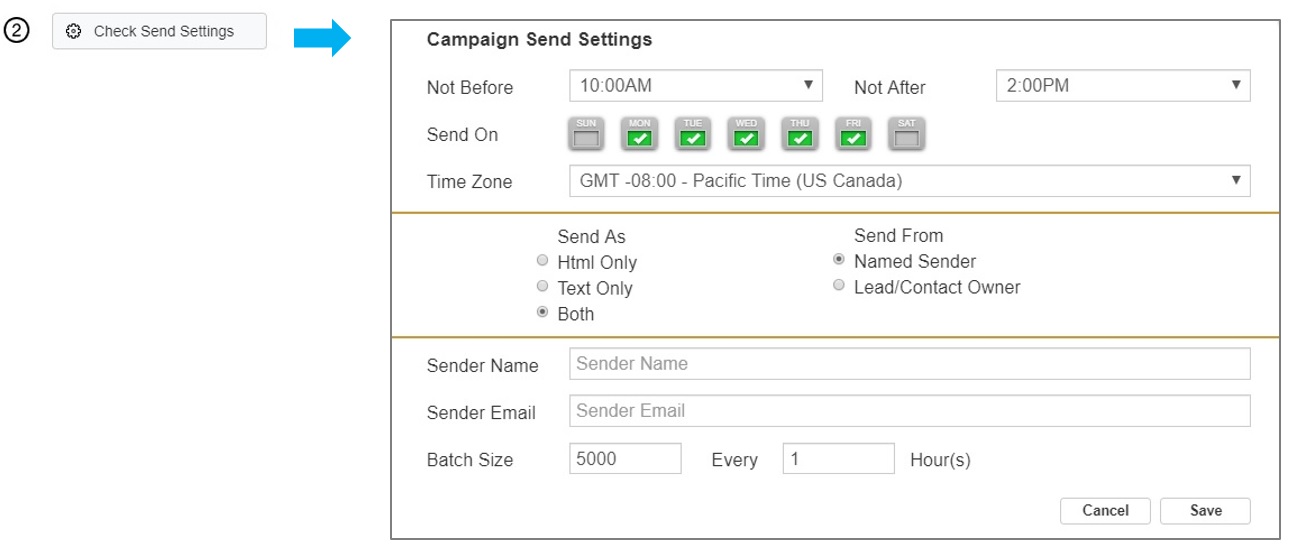
- Check Send Settings
- Test Email

- Activate Email
- Create/Select Template
Feature Improvements in the Designer:
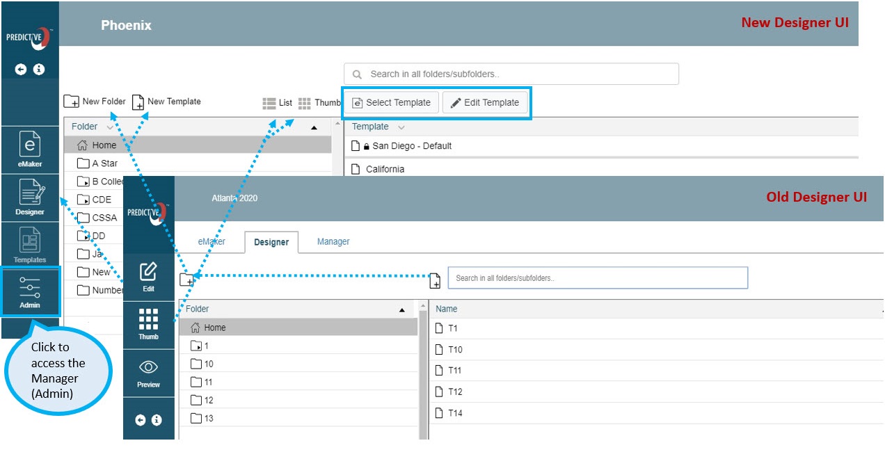
- New eMaker icon on the left rail takes you back to the eMaker. In Design mode, an additional button is available to take you back to the eMaker.
- New ‘Designer’ icon on the left rail takes you to design edit mode.
- No need to toggle between list and thumbnail view of templates, you can now select the view you want.
- Easy access buttons added:
- Highlight the template you want to use and click the ‘Select Template’ button to load it into the eMaker directly.
- Highlight the template you want to use and click the ‘Edit Template’ button to edit the design.
- Labels have been added to new folder and template icons for ease of use.
- The manager tab (where you can adjust template permissions and accessibility) has been renamed ‘Admin’ and is accessible as an icon on the left rail.
Please note that Internet Explorer 11 is not supported by Salesforce Lightning and eMaker. An upgrade to the Edge browser is required.
 (2)
(2) (0)
(0)