Designing Your Content in BeeEditor | Predictive Response
Designing Your Content in BeeEditor
Our drag-n-drop email editor makes it easy to create beautiful messages that can be used to send all sorts of email campaigns: a company newsletter, announce a new product, promote a sale, etc.
It combines great ease of use with many features that give you full control on the design of your emails. Its drag-and-drop interface enables you to design a nice-looking message without any knowledge of HTML, and produces code that adapts automatically to small screens, such as that of a smartphone.
Structure vs. content
For maximum design flexibility, the structure of the message is separated from its content. This means, for example, that you can have rows of content that use different designs for different sections of the message (e.g. full-width background colors, a different number of columns, etc.) without negatively impacting the responsiveness of the message on mobile devices.
Message editing stage & properties panel
The editor is divided into two main areas: the main message editing stage on the left, and the properties panel on the right.
In general, you will be dragging and dropping content elements onto the stage and then editing their properties. This is true for entire structures (e.g. a single-column row) and individual content blocks (e.g. a text content block).
When it comes to images, you can drag & drop image files directly from your desktop onto an image content block. You can also upload them using the File Manager or use the URL of remotely hosted images.
The properties panel is divided into three sections:
- Content
This is where you will choose and edit the specific content elements that make up your message: buttons, images, text blocks, etc. - Rows
Here you can select different structural elements (e.g. a single-column vs. three-column row) to organize your content. - Settings
Here is where you will define some overall settings that affect the entire message. For example, a default font family.
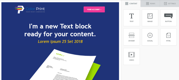
Content
The Content tab allows you to choose a new content element and add it to your message. Just drag and drop a content element (a button, an image, a text block, a transparent or solid divider, social media sharing, etc.) in the message area on the left.
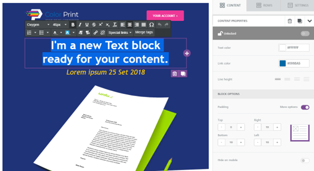
Content properties
Clicking on a content element inside the message will make the content panel switch to Content properties mode, so you can change the settings of that particular content block.
If you click outside of a content element, instead, the row in which the content element is located will be selected and its properties will be available (more on this under Rows below).
The Content properties area changes depending on the content element that has been selected. Some properties are available for any content type, while others are specific for certain content types. For instance, the letter spacing property is available only for content blocks where there’s a text element, like Title, Text, Menu, Button, etc. This setting enables you to customize the spacing in pixels between letters, where 0 is the default spacing for the font in use.

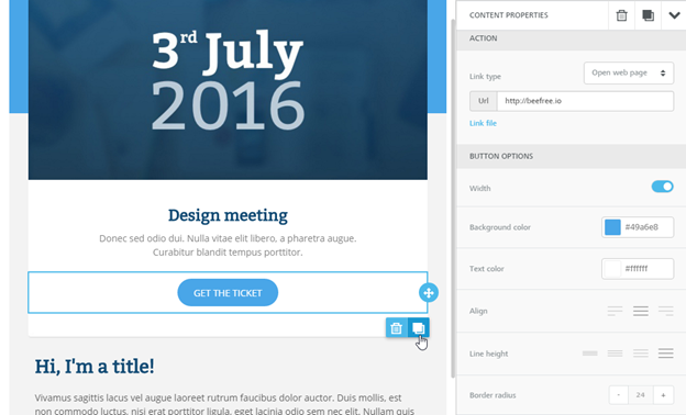
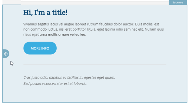
Another example is the button block, where you will see a number of tools to help you style the button and link it to your desired action (open a web page, send an email, make a phone call, etc.). In the example shown below, for instance, the “Show me how” button has been selected.
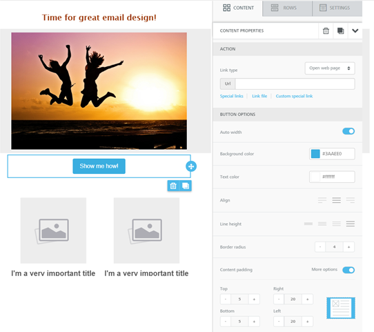
The properties panel switches to button mode and allows you to set the button’s width, background color, text color, alignment, roundness of the corners, padding around the text, … you name it. When the properties panel is longer then the height of the screen, a scroll bar appears on the right side.
With buttons as well as many other content items, the editor gives you great control on the design of your email messages. Some of the controls, including Content padding and Borders have both a simple editing mode – where only one setting is shown – and an advanced editing mode, where more control is provided (e.g. specifying padding for the four sides of the object independently of each other).
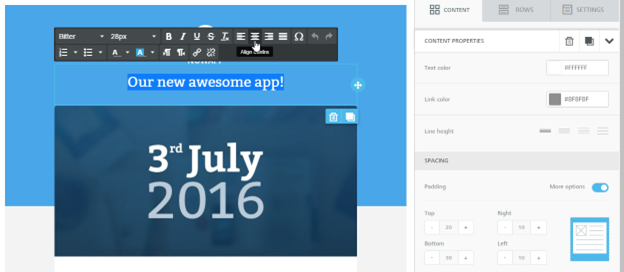
Text editing
If you click inside a text content block, the text editor toolbar will appear directly on the editing stage. It gives you access to a number of text editing tools: font family, font size, basic formatting, text alignment, numbered and non-numbered bullets, font color, links, etc.
Note that if you set the font family to Global Font, it will inherit the font family selected under the BODY tab. This allows you to change the font family for multiple elements at once just by changing that property in the Body tab.
Content settings
The properties panel displays different controls depending on which content element you selected. Here is a description of some of the most frequently used ones.
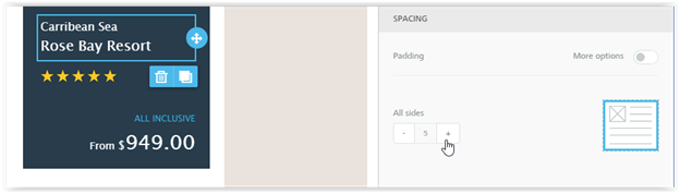
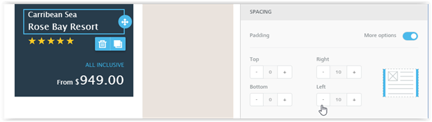
Padding
Padding settings can be configured both for all sides of the selected element…
… or separately for each side.
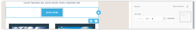
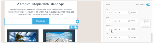
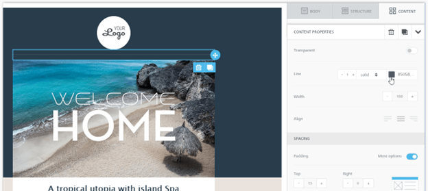
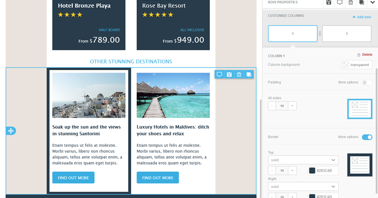
Borders
Border settings can be configured both for all sides of the selected element…
… or separately for each side of a button, column, etc.
Dividers
Dividers help create visual separation between design elements. They can be transparent…
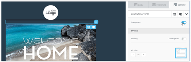
… or visible. Here too, granular control on padding provides great design flexibility.
Color memory
As you pick colors for fonts, background colors, etc., the editor will learn and remember them, making them quickly accessible to style future content elements.
Merge Tags
Lead, contact, and campaign member fields can become merge fields in your campaign, allowing you to use them in your campaign emails.
- Some standard fields are already available, such as ‘Salutation,’ ‘First Name’ and ‘Last Name’.
- You can also use custom created lead, contact, and campaign member fields as merge fields.
- You can add up to 20 custom fields for use in your email editions.
- These custom fields will need to be mapped prior to being used as a merge field in a campaign email.
Learn how to use merge tags in BeeEditor
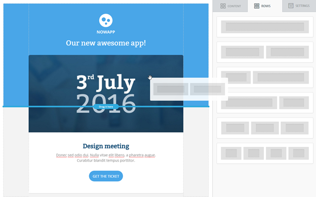
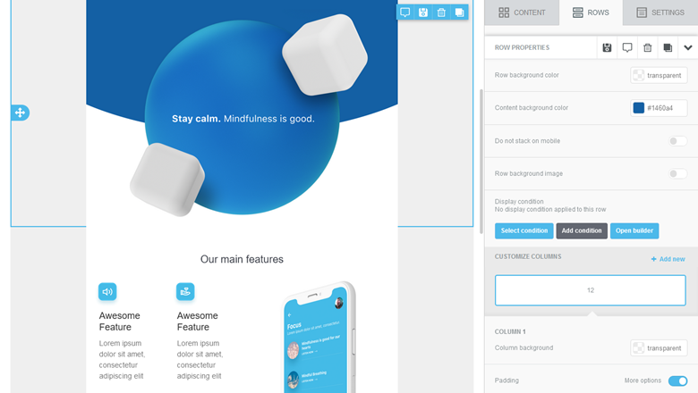
Rows
The Rows panel includes different types of structural elements for your message. They allow you to create different sections of the message. Why different sections? Can’t you just have different content blocks within the same section? You can, but that won’t always work. Rows with different structures allow you to organize content in a way that is different from the preceding and following rows.
For instance, you may need…
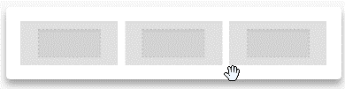
- a single-column row with a hero image to introduce your online store’s new promotion
- a three-column row below it to display some of the store’s best-selling products;
You may also need to have different rows, even if they have the same structure, if you want them to have different row or content background color.
Instead, if you need to switch to a different number of columns for an existing row, you’ll be able to do so by using the “Customize Columns” widget inside the row’s properties.
Selecting a row will switch the properties panel to the row and column settings. The editor provides great flexibility and customization at both the row and column level.
To make message creation even easier and faster, you can clone entire Rows (for example, a picture, a button and a text block) with all of their settings and blocks. This allows what email designers call modular design: you create a module and then replicate it n times in the message.
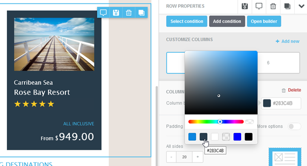
Managing columns within rows
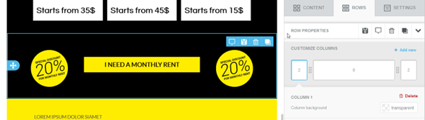
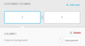
When you select a row, the row properties will have a “customize columns” section, where you can manage the columns inside that row, and apply additional settings.
When you select a row, the row properties will have a “customize columns” section, where you can manage the columns inside that row, and apply additional settings.
Adding a column
Clicking on + Add new action will add a new column inside the row. The New Column is always added to the far right, with default size 2. The widget will automatically find the best resize option to adapt to the addition of a new column. The Minimum column width is 2, and rows can have a maximum of 6 columns. When the maximum number of columns is reached, the + Add new action disappears.
Deleting a column
A column can be removed from a row by clicking the Delete action in the top-right of that Column properties. When a column is deleted, the nearest column on the left gets its width. If the deleted column is the first on the left, the right column will take the width. If there is just one column, the Delete action is not visible.
Resizing columns
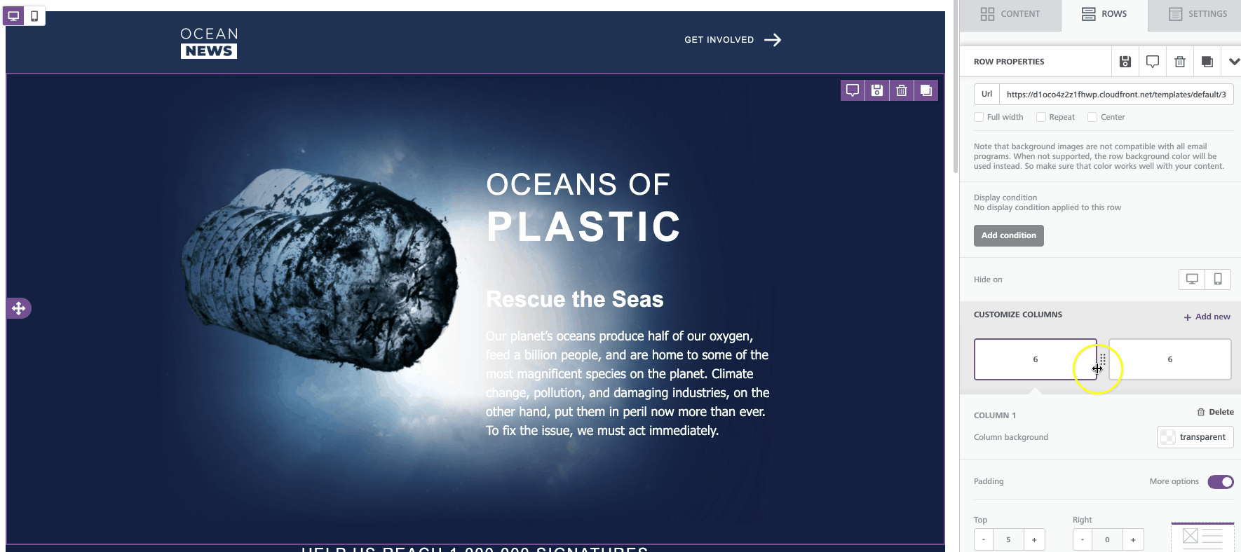
Columns can be resized by dragging the divider icon between two columns to the left or to the right. The stage will reflect the change in real-time as the user resizes the column, to preview the result even before letting go of the divider.
Other column settings
Additional settings at the column level within a row allow control on background color, padding and borders for the selected column.
Selecting rows and content
When you mouse over the message in the message editing area of the editor (the stage), the following happens…
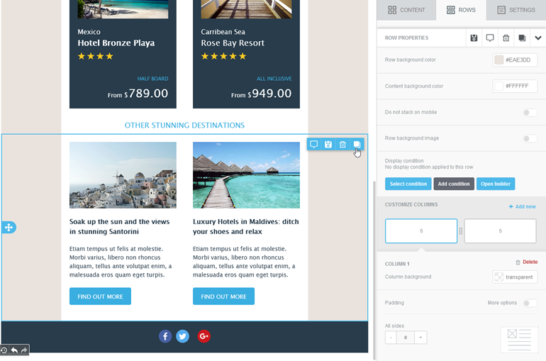
1. You mouse over a block of content (a button in the example below): the editor shows you an icon on the right side that allows you to drag that block of content elsewhere.
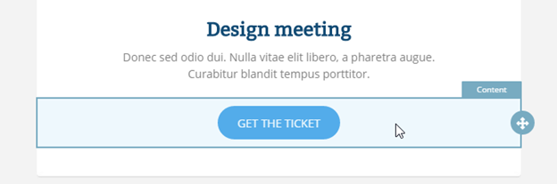
2. You click on a block of content, and the editor will:
- Show you two icons on the stage, which allow you to remove or clone that block of content.
- Change the properties section on the right side of the editor to display a series of properties that you can set for that block of content.
3. You mouse over an area that is free of content, i.e. the row in which the content is located. The editor will highlight it and show you an icon that allows you to drag that entire row elsewhere on the stage.
4. You click on a row, and the editor will:
- Deselect any block of content that had been previously selected.
- Select the row, and show you two icons that allow you to remove or clone the entire row and all its content.
- Change the properties section on the right side of the editor to display a series of properties that apply to that column within the row. A row can contain more than one column.
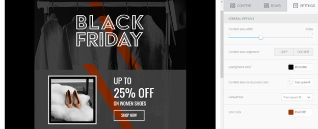
Settings
From this tab you can modify general settings that apply to the entire message:
- Content area width: this is the width of the area where content blocks are dropped. According to email marketing best practices, it should typically be set to 600px or less. Please note that this is the maximum width that will be used on larger devices. When the device’s screen is smaller, the message will adjust automatically to it.
- Content area alignment: set the body of the email to be aligned to the center (default behavior) or to the left. This setting will not affect the alignment of the content blocks in the email.
- Background color: it’s the message background color. This setting is effective only for rows (and columns) where a color has not been specified. Otherwise, the background color specified for that content structure will be used.
- Content area background color: it’s the background color for the content area. This setting is effective only for rows and columns where a color has not been specified.
- Default font: it’s the default font that will be used when another font family has not been specified. This setting affects all text set to use the global font.
- Link color: it’s the link color. As above, this setting affects all text links set to use the default color.
Complex Elements using Dynamic Content
You can utilize the Dynamic Content feature in BeeEditor to save complex design elements for future use. Often these include email headings, social media icons, and email footers. Watch the below video to see how you can use Dynamic Content to save your content.
Mobile optimization options
Often content in an email is organized in multiple columns. When viewed on a mobile device, those columns can become too narrow and lead to a sub-optimal reading experience. To guarantee a better experience while reading emails on mobile devices, the editor generates HTML code that makes columns stack vertically. This way, content is reorganized to make zooming unnecessary and is easy to scroll with a finger.
Sometimes you may want to make changes to the default mobile optimization settings that the editor uses. There are plenty of different features you can use to do this. Let’s go over the different options that can impact the mobile version of your design.
Do not stack on mobile
Although it usually helps, there are cases where the vertical stacking of columns may not lead to an optimal result.
Typical scenarios include navigation bars, icons, and other horizontal design elements. For example, when using a row to display a navigation bar with text links, a vertical layout could take too much space, hiding important parts of the message or giving too much visibility at the top of the email to content that is not supposed to be that prominent.
The Do not stack on mobile option is available inside Row properties, toggled off by default.
This setting allows users of the editor to decide when to override the default stacking behavior. Email design best practices suggest a careful use of this display setting. A user-friendly vertical layout on mobile makes sense in most cases. As always, it is up to you and your creativity when and how to use this option.
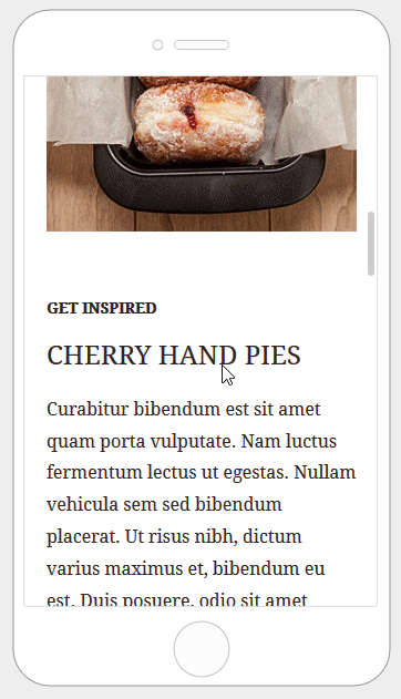
Reverse stack order on mobile
In some cases, the columns stacked on mobile can work better in a reversed order. In this case, you can toggle on Reverse stack order on mobile inside the row properties.
Here are two sections from an email message:
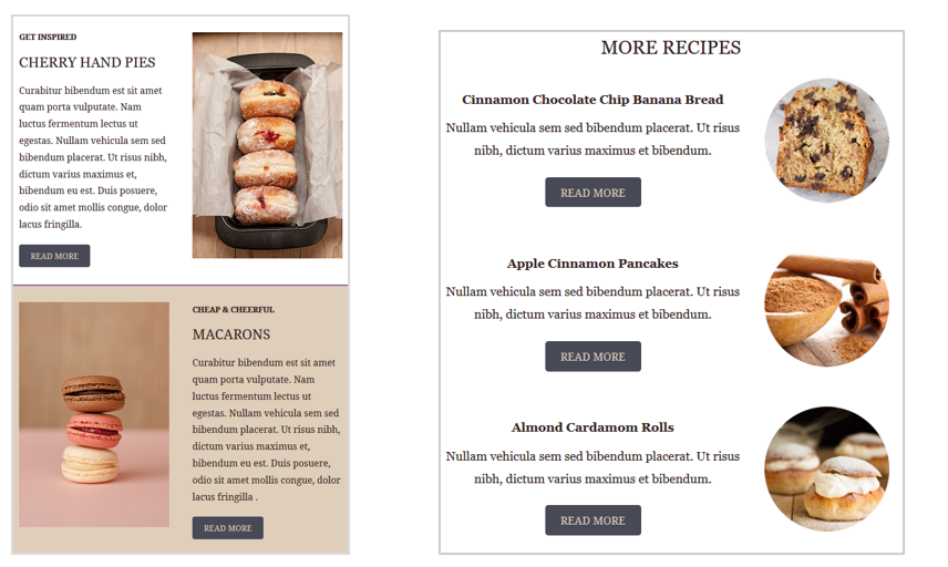
Here is how these two sections render on mobile by default:

Here is how the email layout renders when you stack columns in reverse order.
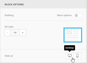
Hide content on mobile or desktop
All content blocks in the editor include a Hide on setting in the content properties. To use it, scroll down until you see the “Block options” section.
This setting is perfect for creating device-specific parts for your email, from things like optimized buttons for mobile, up to entire sections with different layouts on mobile versus desktop. In this last case, you may also want to hide an entire row on a device by using the same Hide on setting.
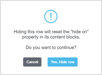
Hiding a row will apply the “Hide on” property to all the blocks inside that row. For this reason, when you hide a row:
- You won’t be able to change the “Hide on”setting for a block that is part of a hidden row.
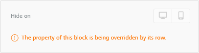
- Any “Hide on” setting applied to blocks will be reset. The editor will ask you for a confirmation in this case.
Once you’ve finished hiding content, you can check the results by going into the message preview.
Mobile design mode
With Mobile design mode, you can easily design emails and pages for mobile without the need to switch back and forth between editing and preview. You’ll be able to move between desktop and mobile view to see and edit content. This way, you understand how your design looks on mobile without leaving the editor to go into preview.
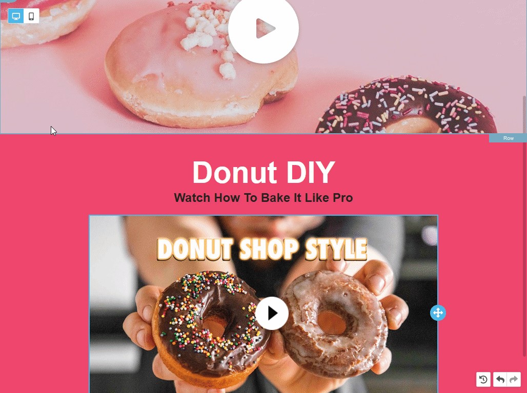
You will see two icons in the upper left corner, one for desktop and one for mobile.
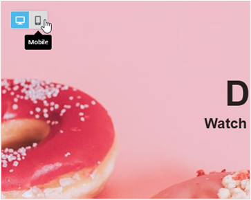
The desktop view will use the full width available in your browser window. Clicking on the Mobile icon will reduce the work area width to 320px. This view retains most of the editor’s functionality, so you can continue working as usual, while getting an immediate look at the mobile rendering of your email.
Another advantage of Mobile design mode is that you can instantly visualize the results of mobile optimization options – such as do not stack/reverse stack/hide on mobile – and stretch out the editor’s design flexibility. Using these settings becomes more convenient, as you can immediately see their effect in the desktop and mobile views.
An important note: with Mobile design mode, you are still working on a single template with the same content. These are not two separate versions of the template. Unless a content has a device-specific setting, the desktop view will reflect edits made in the mobile view.
When using the Hide on setting, you’ll get an additional aid: a “Visibility” icon next to the Desktop and Mobile icons.
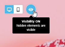
When Visibility is ON (the default behavior)
- the editor will display content blocks set as hidden for the current device;
- Those blocks will have a blurred effect to signify that they are hidden for that device;
- They will also have a small icon in the outline of the block when hovering with the mouse;
When Visibility is OFF
- elements set as hidden for the current view are removed
- the template will appear as the version of the email/page meant for mobile audiences
Editor limitations in mobile view
When in mobile view, the editor retains most of its functionalities, with a few exceptions:
- You cannot change text in text elements – text blocks, titles, buttons -, and the text toolbar won’t pop up, so you can only make changes in the editor’s sidebar.
- You cannot change the content area width; it can only be changed in the desktop view;
- You can add and delete columns in a row, but you cannot resize them.
The File Manager
What it does
The editor includes a built-in file manager. The file manager is the component that you will use to browse, search, and select the images and documents that you wish to use in your email message.
With the handy file manager you can:
- Browse, search, and sort existing files
- Switch between list and grid view
- Import new files
- Create new folders
- Preview and insert images into your message
How it looks
The file manager will open over the editor, covering the entire working area. This allows you to browse your files without worrying about your screen size or resolution.
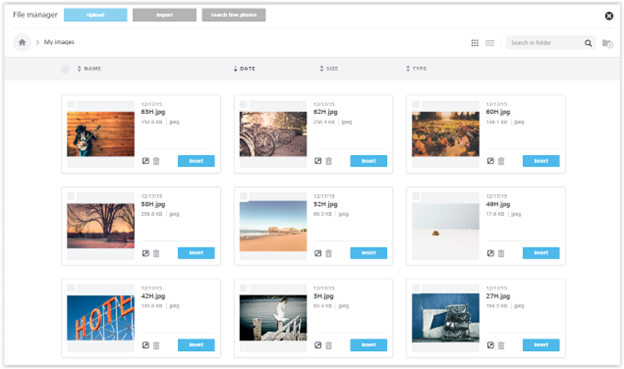
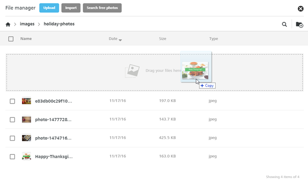
You will find a top section with actions and navigation helpers, with most of the space used to list your files and the information you need to work with them. By default, folders and images are shown in Grid view. If you switch to List view, it will be used next time you open the File Manager. Here is a visual example of images within a folder, in Grid view:
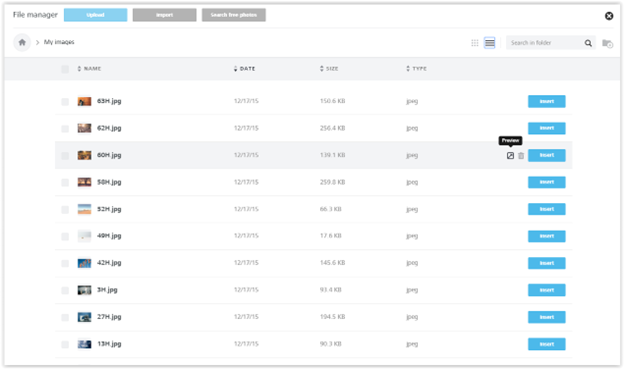
And here is the same folder, in List view.
How you access it
The file manager will load in several scenarios.
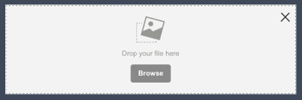
a. When you click on the Browse button in an image placeholder, which is displayed when you drag and drop an image content block into a message.
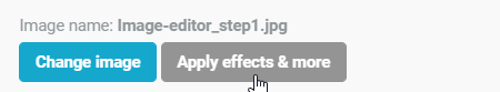
b. When you click the Change image button in the image properties panel:
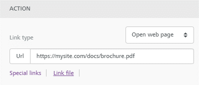
c. When you click on Link file when working with images and buttons:
How to upload files
The quickest way to upload a file into the file manager is to drag it from your computer to the file manager window, dropping it anywhere on the page.
You can also:
- Browse and upload from your computer using the Upload button.
- Import from an external application using the Import button (see more below), if this feature has been enabled.
- Search and import free stock photos using the Search free photos button, if this feature has been enabled.
Note that there is an upload limit: the maximum allowed file size is 12MB.
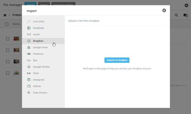
How to import files from other applications
The Importfeature allows you to connect external applications like DropBox, Google Drive, Instagram and more, and import your files.
How to browse or search files
To locate your desired image or document, browse your folders and order their content by name, date, size or type by clicking on the sort labels on top of the list.
An arrow icon next to this labels means that this is the current filter, and its orientation will tell you the order, ascending or descending.
Too many files in the selected folder? Click on the lens icon to run a search. Results will be filtered on the fly. Mind that this search is performed only in the current folder, and not in your entire repository.
How to use files
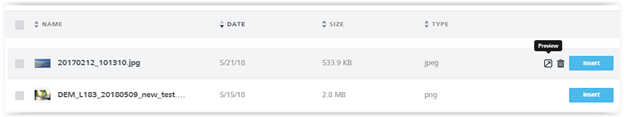
When you move your cursor over a file or folder, that row will be highlighted and the available action icons will be shown on the right side:
- Preview for files
- Delete for both files and folders
If an action is momentarily not available, you will be notified by the tooltip text of the icon, such as when you try to delete a folder that contains files, because only empty folders can be deleted.
If you want to delete multiple files or folders, use the checkboxes to select them, the delete action will be shown on top of the list. Only elements that can be deleted will have a selectable check-box.
How to organize folders
You can create the folder structure you prefer to organize your files. To add new folders, use the Add folder icon.
For your folder names you can use letters (upper and lower case), numbers, spaces, periods (.), hyphens (-), or underscores (_).
To navigate to the parent folder, use the top breadcrumb. Clicking the home icon will take you to your root folder.
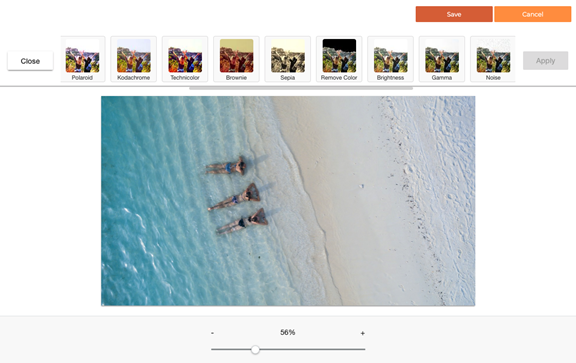
The image editor
Editing images
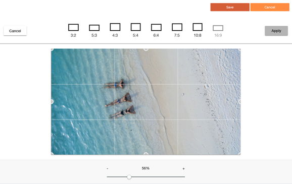
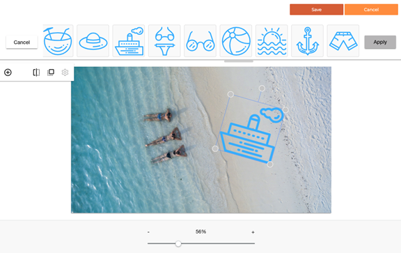
The email editor includes an image editor that allows you to easily crop, rotate, resize, apply filters/frames, add stickers… and much more – to any image, without leaving the editor.

Accessing the image editor
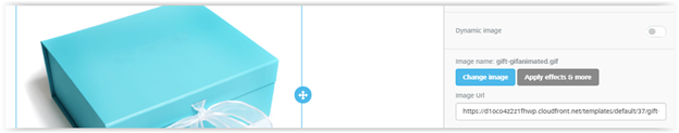
When you select an image in the editor an “Apply effects & more” button is shown. Click on it to have access to a tool that allows you to edit the image in a variety of ways.
The editor has a lot of cool features, from filters to resizing & cropping tools.
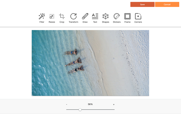
You can quickly and easily change the image size…
… apply some cool stickers:
There are also a number of predefined filters that can help you very quickly change the look of the image.
Additional blocks & widgets
Icons
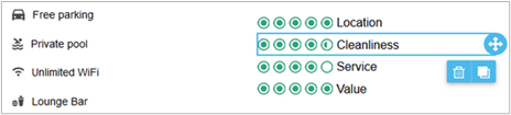
When designing an email, several layouts can be created by combining icons or small images, often with some copy. That is why the editor has an Icons content block for creating icon-based content. This block is also not restricted by row structures, allowing you more flexibility in your designs.
You can use Icons to create visual bullet lists, ratings, properties, logo galleries, etc.
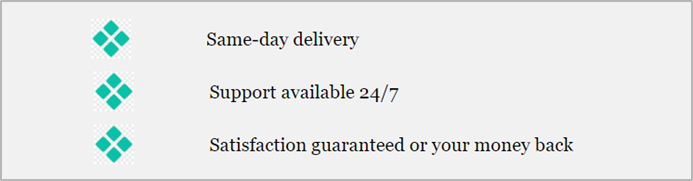
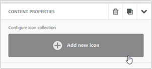
To get started, drag the Icons content block into a row. A placeholder will fill the content block; click on it to open the icon options in the sidebar. Click on Add new icon to add the first icon. A predefined icon will populate the block.
Then, click on Change image to select an image from the file manager. Once done, you may edit the image with our image editor by clicking on Apply effects & more. Repeat this process until you complete your icon collection.
If you use the toggle to open More options, you’ll find a couple of options specific to Icons content blocks.
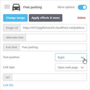
Adding the Icon text will create an accompanying section of text that you can position on top, bottom, left, or right of the icon. From this panel, you may also add a link for the icon and the image’s alternate text.
If you have multiple icons, you can change their order by clicking and dragging them in the panel.

Scrolling down through the properties, you will see a few settings that are specific for Icons.
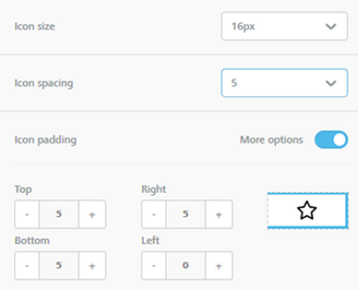
You can pick a size for the icons, decide the spacing between them, and apply additional padding that will affect all the icons.
Title
When creating an email or a web page, you typically need to add titles to establish a hierarchy in your content.

With our editor, you can create title blocks so that the output HTML will render those titles with heading tags (H1, H2, H3). Using heading tags in HTML is important for accessibility, as users that need a screen reader can navigate emails and web pages according to their headings, listen to a list of all headings, and skip to a desired heading to begin reading from that point.
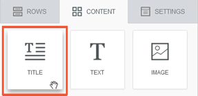
To add a Title, use the Title block available in the Content tab of the editor.
Once dragged into the stage, a title block will be created.
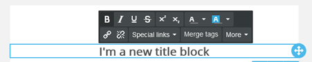
As you can see, the block has a “lite” version of the text toolbar, similar to the one available for the Button block. Let’s have a look at the content properties for this block.
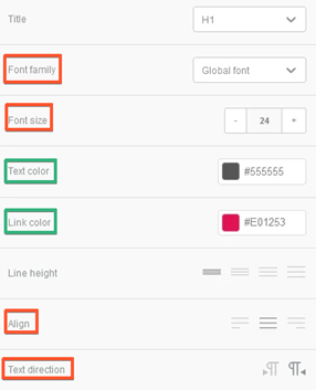
- The “Title” property is used to select the proper heading style (H1/H2/H3).
- The settings highlighted in red are the ones that are missing from the usual text toolbar and are applied to the whole block.
- The settings highlighted in green are applied to the whole block, unless the same setting has been changed for the whole block or for a part using the controls on the text toolbar. In that case, the color selected with the toolbar won’t be overridden.
Using Title for desktop vs mobile
By using two separate Title blocks and applying the hide on desktop/mobile setting, you can have titles with the same title tag (e.g. H1) but with different font styling. This comes super-handy if you need to differentiate title size and style on mobile and desktop, while keeping the same heading tag.
Smart Links
Using our email editor, you can add View as Page and Forward to Friend links directly from the template builder.
The View as Page option allows email recipients to view your email in their browser. This gives recipients the ability to view your email if they have HTML disabled or images turned off in their email client.
When an email is forwarded using the Forward to Friend option, it retains the email stylization, subscriber-specific links, merge tags, and allows for the forwarding of an email to multiple contacts at once.
When the email has been forwarded with an email client instead of the “forward to a friend” link, the recipient may see broken formatting. When emails are forwarded by an email client, the HTML code is converted to use that email client’s proprietary code. As all email clients render emails differently, there’s no guarantee the email client that receives the forward will understand that code, resulting in broken formatting. Using the “Forward to a friend” option ensures the recipients will receive the original email layout.

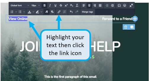
Adding the Smart Link Token:
From the design step within the email editor, place text such as “View Online” or “Forward to a Friend” in a text box, button, or row. Highlight the text, and select the link icon from the toolbar.
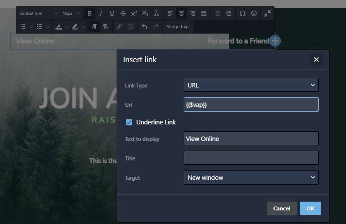
Next, enter the token as you would an URL using the https protocol (screenshot below), then click OK.
- The token for View as Page is {{$vap}}
- The token for Forward to a Friend is {{$fwd}}
Video
The video content block allows you to share your video content easily in your emails. You only need to copy and paste the URL of your video from YouTube or Vimeo, and the editor will do the rest: it will automatically grab the cover image for the video, overlay a Play icon on top of it, and link it to the actual video content.
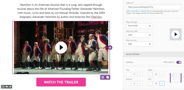
The “Content properties” section will ask you to provide a video URL from YouTube or Vimeo, the popular video hosting services that are currently supported (if you would like us to support other video hosting services, let us know).
Once you insert a valid URL, the content block in the editing panel will display the cover image for the video with a Play icon overlaid on top of it. You can edit the type, color, and size of the Play icon to change the way it looks. For example, on some videos a white icon will work better than a black one, or vice versa.
Note that the editor cannot access password-protected videos to get the cover image.
Additional notes about embedding video in email:
- This feature does not embed the actual video in the email, but rather links to it in a smart way.
- The reason why the actual video content is not embedded into the message is that, unfortunately, it doesn’t work very well. Many email clients do not support it.
- Additionally, many emails are opened on mobile devices and viewing videos on a mobile device can cause substantial data usage in addition to a poor user experience due to the quality of the data connection.
Undo, Redo & Timeline
Ever made a mistake and wanted to undo it? What if you wanted to go back to several edits ago? And what if you changed your mind after all and decided that the latest changes worked?
The Undo feature allows you to rewind and fast-forward to any point in your recent edit history. When changes are detected, a compact Undo widget displays in the bottom left corner of the stage, as shown below.
Clicking on the Undo or the Redo arrows allows you to undo the latest edit or re-apply it.
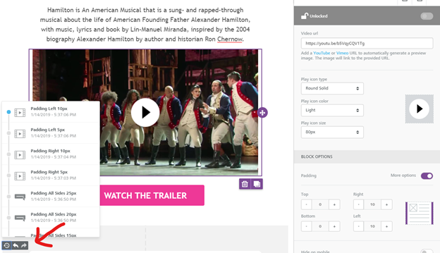
The Timeline icon, instead, loads an additional panel (shown above) that allows you to browse through the most recent changes. For each recent change, it displays:
- An icon to identify the content element type (an image, text, etc.)
- A description of what changed, giving the new property value (if any)
- The exact time it happened
These details help determine what modification was applied, and if desired… rewind the message to that state.
The Undo widget currently displays the last 15 edits in the timeline, but you can always rewind to the Message Opened state to undo all changes since the message was initially opened in the editor.
Custom HTML
The Custom HTML content block allows you to add your own HTML code to an email message that you are designing with the editor. It’s as simple to use as a text block.
HTML experts: Using your own code may affect how the message is rendered in email clients, preventing it from adjusting to the screen size (i.e. the “responsiveness” of the message). Make sure to use HTML that is email compliant and responsive.
Adding live content from external providers
Product recommendations, dynamic ads, personalized maps, countdowns… all of this advanced content can be easily included in a message created with the editor. Just copy and paste the code provided to you by the vendor that you are working with.
How do I add my HTML code?
To add your code just drag an HTML content element into your message. It can be positioned alone, with other HTML content items, or mixed with other types of content:
The newly inserted content block will show some default placeholder text. Click on it and the right-side property panel will display the HTML code editing pane. You will find some placeholder code inside the editing area:
Paste your own HTML code or write it directly in the editing area. The system will highlight your syntax and indent your code to make it more readable.
Which HTML tags are allowed?
The HTML content will automatically correct some issues like HTML tags that are left open, and strip out code that cannot be used, such as script tags or iframe tags (this code tags are not allowed by the major part of email clients, can cause deliverability problems or security risks).
Allowed tags list:
a, abbr, acronym, address, area, b, bdo, big, blockquote, button, caption, center, cite, code, colgroup, dd, del, dfn, dir, div, dl, dt, em, fieldset, font, form, h1, h2, h3, h4, h5, h6, i, ins, kbd, label, legend, li, map, menu, ol, optgroup, option, p, pre, q, s, samp, select, small, span, strike, strong, sub, sup, table, tbody, td, textarea, tfoot, th, thead, u, tr, tt, u, ul, var
Allowed attributes list:
- general attributes: style, id, class, data-*, title
- a: href, name, target
- img: align, alt, border height, hspace, src, vspace, width, usemap
- table: align, bgcolor, border, cellpadding, cellspacing, width
- tbody: align, valign
- td: align, bgcolor, colspan, height, rowspan, valign, width
- tr: align, bgcolor, valign
- tfoot: align, valign
- th: align, bicolor, colspan, height, rowspan, valign, width
- thead: align, valign
- li: type
- map: name
- area: alt, coords, href, shape, target
 (1)
(1) (0)
(0)